In case you aren’t familiar, I would like to introduce you to the violin plot.
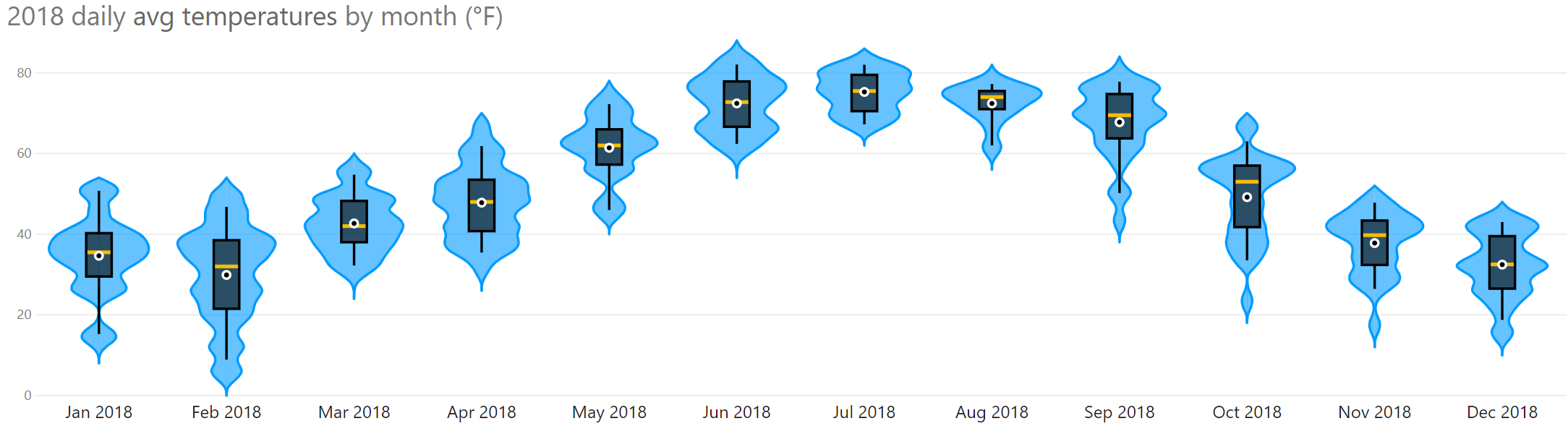
A violin plot is a nifty chart that shows both distribution and density of data. It’s essentially a box plot with a density plot on each side. Box plots are a common way to show variation in data, but their limitation is that you can’t see frequency of values. In other words, you can see statistics such as min, max, median, mean, or quartiles, but you can’t see the individual values nor how often they occurred.
The violin plot overcomes this limitation (by adding the density plot) without taking up much more room on the canvas.
In Power BI, you can quickly make a violin plot using a custom visual. The Violin Plot custom visual (created by Daniel Marsh-Patrick) has many useful formatting options. First, you can choose to turn off the box plot and just show the density plot. Or you can choose to trade the box plot for a barcode plot.
Formatting the Violin Plot
There are several sections of formatting for this visual. I’ll call out a few important options here. First, the Violin Options allow you to change the following settings related to the density plot portion of the violin plot.
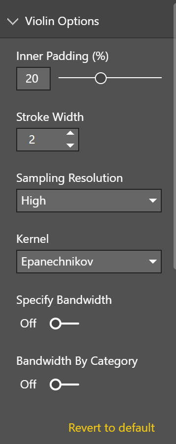
Inner padding controls the space between each violin. Stroke width changes the width of the outline of the density plot. The sampling resolution controls the detail in the outline of the density plot. Check out Wikipedia to learn more about the kernel density estimation options.
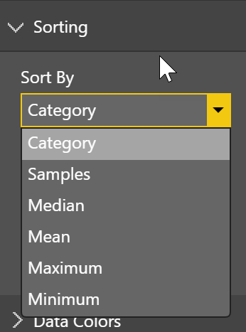
The Sorting section allows you to choose the display order of the plots. In the example above, the sort order is set to sort by category. You can then choose whether the items should be sorted ascending or descending.
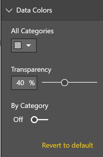
Next you can choose the color and transparency of your density plot. You have the ability to choose a different color for each plot (violin), but please don’t unless you have a good reason to do so.
The Combo Plot section controls the look of the bar code plot or box plot. Inner padding determines the width of the plot. Stroke width controls the width of the individual lines in the bar code plot, or the outline and whiskers in the box plot. You can change the box or bar color in this section. For the barcode plot, you can choose whether you would like to show the first and third quartiles and the median the color, line thickness, and line style of their markers.
Also make sure to check out the Tooltip section. It allows you to show various statistics in the tooltip without having to calculate them in DAX or show them elsewhere in the visual.
Violin Plot Custom Visual Issues & Limitations
This is a well designed custom visual, but there are a couple of small things I hope will be enhanced in the future.
- The mean and standard deviation in the tooltip are not rounded to a reasonable amount of digits after the decimal.
- The visual does not seem to respond to the Show Data keyboard command that places data in a screen reader friendly table.
As always, make sure to read the fine print about what each custom visual is allowed to do. Make sure you understand the permissions you are granting and that you and your organization are ok with them. For example, I used public weather data in my violin plot, so I had no concerns about sending the data over the internet. I would be more cautious if I were dealing with something more sensitive like patient data in a hospital.
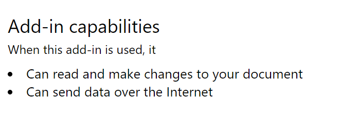
Update: The creator of the violin plot left a great comment on this post to let us know that the two capabilities listed above are boilerplate from Microsoft. The violin plot privacy policy can be found here. The violin plot does not specifically send data over the internet.
Introducing the Violin Plot to Your Users
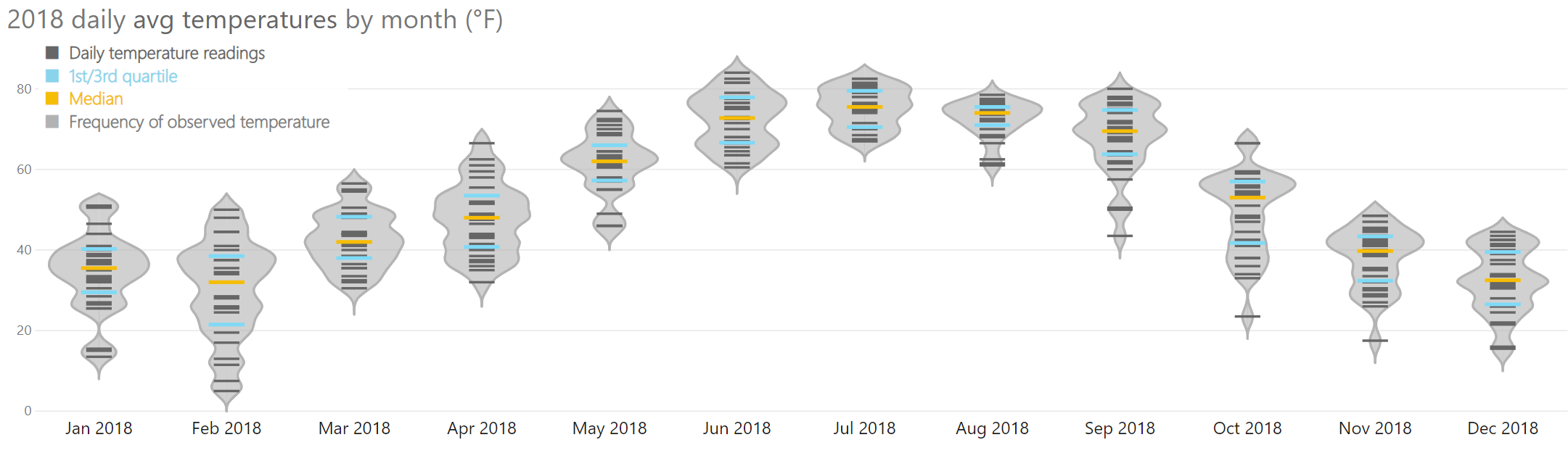
I think violin plots (especially the flavor with the bar code plot) are fairly easy to read once you have seen one, but many people may not be familiar with them. In my weather example above, I made an extra legend to help explain what the various colors of lines mean.
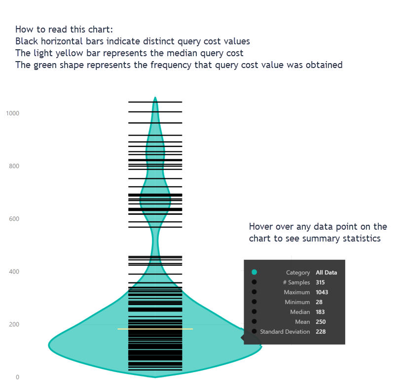
Another thing you might consider is adding an explainer on how to read the chart. I used a violin plot with a coworker who does not nerd out on data viz to show query costs from queries executed in SQL Server, and I added an image that explains how to read the chart.
After all, we use data visualization to analyze and present data effectively. If our users don’t understand it, we aren’t doing our job well.
Have you used the violin plot in Power BI? Leave me a comment about what kind of data you used it with and how you liked the resulting visual.
Great post, Meagan! For me, educating end users in how to read visuals is one of the greatest challenges of this work. At the same time, it’s an opportunity to help more folks become smarter about data.
Thank you Meagan
Was n ot aware if this one
Hi Meagan – thanks very much for using the visual, and I really enjoyed your write-up!
Regarding the issues and limitations, this has been highly valuable reading:
Totally aware of the tooltip formatting issues – these should be coupled to your measure from the data model, but this has created issues if you want to format your y-axis differently to this. The next version will provide formatting options for each configurable section, allowing you to tweak further.
I’ll look into the accessibility stuff – I believe that some of the major changes have only just been introduced via Desktop, so I’ll research if the custom visuals framework supports this, and I’ll do my best to support this as soon as I can.
Regarding the permissions, this is a boilerplate permission that gets assigned via AppSouce. The visual doesn’t send any data over the Internet – we have to supply a privacy policy for each visual we publish – mine’s available at https://bitbucket.org/dm-p/power-bi-visuals-violin-plot/wiki/Privacy%20Policy. The only network transaction that will take place when adding the visual is the one that Power BI does to make sure that you’r reading the latest version from the Marketplace (and updating it if there is a newer one).
The additional legend was a great idea, and really improves the readability of the visual. Is this something you’d like to see as something configurable? If so, I’d be happy to see if I can make it happen.
If you have any other suggestions or issues, please let me know via https://bitbucket.org/dm-p/power-bi-visuals-violin-plot/issues/new
Thank you so much for your comment! I have updated my post to more accurately reflect data privacy when using the violin plot.
Some other custom visuals seem to work with the accessible show data command (Alt+Shift+F11), but the way the data is arranged in the table isn’t always useful. Still, something is better than nothing. I have not made a custom visual before, so I’m not sure how that works on the development side.
It would be great if you could add a configurable legend similar to what I did.
Thank you for making a great custom visual and for your response here. If you will tweet (or let me know somehow) when you have made enhancements I’m happy to blog again to help get the word out.
No worries – glad you’re finding it useful! I’ve not been too active on Twitter in the past (trying to change that!) but I do typically post updates to that feed – I’ll be sure to include you when the next one’s coming out. I’ll add both those features (accessibility hotkey and legend) to the backlog and hopefully they should be reasonably straightforward.
Regarding the arrangement of the data in the table, this is to maximise the amount of rows we can get out of a custom visual – we are capped at 30K rows, so doing it this way around avoids us getting null aggregations for other categories (which all add to the total and consume much more memory than necessary). IIRC I believe that the MAQ Software box plot visual uses this trick too. Not ideal for the end-user though 🙁
Thanks, Megan! Very interesting, and useful!
What is the sampling resolution in the options? Can someone please explain? Also is there a good resource as to which Kernel to use for my dataset?
The creator of the violin plot has good documentation on Bitbucket to help you understand sampling and kernel choice here: https://bitbucket.org/dm-p/power-bi-visuals-violin-plot/wiki/Usage%20and%20Visual%20Properties#markdown-header-kernels