I live in Kansas City, and I like to be aware of local events and government affairs. KC has a program called KCStat, which monitors the city’s progress toward its 5-year city-wide business plan. As part of this program, the Mayor and City Manager moderate a KCStat meeting each month, and the conversation and data are live tweeted. I love the program as well as all of the open data available on Data.KCMO.org. But as a data viz enthusiast, I cringe at some of the charts that are tweeted out from KCStat. I wish that Kansas City would let me fix their charts – or better yet, let me come and teach a data viz class and facilitate a chart makeover session (if anyone from the city of KCMO is reading this, I would gladly donate my time to do this).
This week, a particular chart from KCStat caught my eye.
Allocation of $1,000 Budget By Goal Area at Citizen Work Sessions as shown. #KCStat pic.twitter.com/3gM3yn8fKV
— Kansas City, MO (@KCMO) December 1, 2015
Story
There is an interesting back story to this chart. KCMO invited citizens to attend Citizen Work Sessions, in which they organized into small groups and played a game to learn about the city budget and provide feedback. In the first scenario of the game, each group was asked to allocate a $100 budget across the city’s five major goals (as laid out in KC’s Citywide Business Plan) without reference to specific programs within the goals. In the second scenario, they were given a total budget of $1000 allocated to match the current city budget and were asked to identify the top 3 – 5 priority programs under each goal and then cut $50 from individual programs (as opposed to just the broad goals). The chart from the tweet represents the results of the game.
Chart Design
The table shows the starting allocation and the average final allocation after the $50 cut (averaged because multiple groups performed this exercise). The line in the chart is tied to the starting allocation, and there are several markers that show the values assigned by the individual groups after the budget cut (which would equal the ending final average amount when averaged together).
For me, this chart is ineffective and cluttered.
- It’s using a line chart for categorical comparisons. With rare exceptions for multivariate analysis, slope charts, and maybe a few other situations, line charts are best used to show trends over time.
- The markers are all bunched together to the point that they really aren’t useful, especially given the scale of the y-axis and the size of the markers. It would be nice to see the individual markers if there were any dramatic outliers, but that is not the case with this data.
- The placement of the table in the middle of the chart between the axis labels and the data points is distracting. If you include axis labels rather than directly labeling, it is because you want to allow users to see the scale and follow a label across to a data point. But the line your eyes follow with this chart is interrupted by the big blue table in the middle of the graph.
- I believe the table column header for “Ending Average Final (after cutting $50m)” is mislabeled. It should be after cutting $50, since we are dealing with only $1000 to begin with. I thought maybe it was accidentally scaled to the city’s real budget amount, but it looks like the Governmental Activities budget is about $953 million so that didn’t make sense. Either way, it confused me and then I decided it was mistyped. Especially with this kind of subject matter (budgets and government communication to the public), you want to be as clear as possible and review your charts to remove any possible confusion.
- The data in the chart is the least emphasized thing in the image. The thing that is most eye-catching is the header row of the table or perhaps the graph title due to the use of bold colors.
- Goal areas are abbreviated in the table and wrapped on multiple lines in the graph x-axis.
- This chart could really use some context. I had to dig through the presentation and the city’s open data to understand the situation that explains this chart. A few sentences to go with it would have been nice so readers know what they are looking at.
So I decided to take this image and redo it with better design decisions. I ended up with two different versions. I used Excel to create these makeovers. I’m sure I’ll do future makeovers with Power BI or Tableau, but I think Excel worked just fine for this, and is probably what was used to make the original data viz.
Version 1
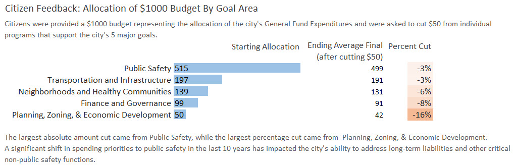
First, I added some explanatory text for context to help communicate my message. If you don’t know about the Citizen Work Sessions, this chart might be confusing. The note about the shift in spending to public safety came from the FY 2016 – 2021 Citywide Business Plan. I thought it was important context to note as city council members and government officials have hard decisions to make when it comes to the budget.
So my data viz communicates two things:
- explains the allocation of budget across goal areas
- notes that there was a budget cut and shows the impact on the budget and allocation
You’ll notice in this version I used data bars embedded in my table rather than embedding a table inside of my chart. Microcharts can be a good way to visually represent data while still providing detailed numbers. While tables primarily interact with our verbal system, graphs interact with our visual system to give us a quick picture of how different data points are related. The data bars form a horizontal bar chart, which is a great way to show a categorical comparison. Here I’m comparing the initial budget amount allocated for each goal area. My rows are ordered by descending value of the budget amounts.
Also, because I now have my labels on rows, I have plenty of room to type the full name of the goal area without abbreviating or wrapping.
I added the percent cut data because after seeing the numbers, I immediately start doing the math of (499 – 515)/515 to understand the difference. So I just saved everyone some time and showed it in my table. The absolute numbers are definitely useful, but it’s also important to understand the impact of the cut to each goal. A 16% cut could be devastating to an already small budget. I used conditional highlighting to help emphasize the impact of the cut, so the largest cut has the most intense color.
KCMO didn’t provide the individual data points for the markers, so I couldn’t use the individual data points in my chart makeover. But I think I might have chosen not to show the individual data points anyway because the value that they add is not worth the space they take up in the visualization. And they’re not core to my message. What I’m trying to show is where people generally made cuts when faced with that decision. I don’t have to show all the data points just because I have them.
The strategic use of color draws your eyes to the important parts of the data (the allocation to goals and the effect of the budget cut) rather than the box around the chart tile or the table column header like it did in the original visualization.
Version 2

I used the same explanatory text in this version. This time, I created a clustered horizontal bar chart and directly labeled the bars, removing the need to show a table. This chart shows me two things: the allocation of the budgets across goals and the and the difference between the original budget and the average budget after cuts. This time I’m not focusing on the impact of the cut to the total budget for the goal, just visually showing where cuts happened and allowing the reader to make the comparison with the bars.
Again, I switched to a horizontal bar char so I have a good categorical comparison and my labels have plenty of room and don’t have to be wrapped or abbreviated. I put the legend at the top left so you have that information before going to read the chart (our eyes tend to move across the chart in a “z”).
And again your eyes are drawn toward the color first, which is where the important data is located.
Data Visualization Critiques & Makeovers
Feel free to leave comments on how you would improve my chart makeovers. I would appreciate the feedback.
If you like chart makeovers, there are several sites that critique and redesign data visualizations. Here are some of my favorites:
One Comment