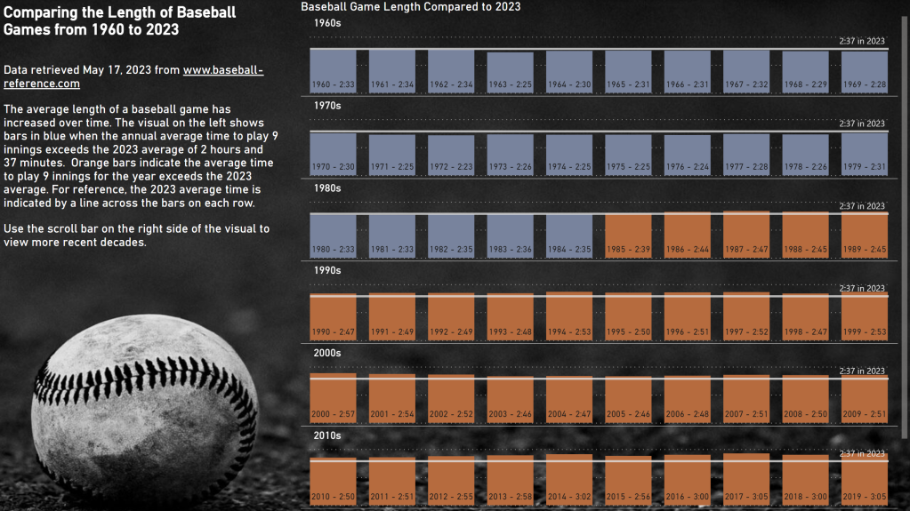
Did you know that you can create labels on bar charts that don’t use the fields in the field wells? You absolutely can!
I did this in the exercise for Workout Wednesday 2023 for Power BI Week 20.

Notice the label on each column that shows the year and average game length in h:mm format.
These custom labels are available for any bar or column chart – small multiples are not required.
How to add custom labels
The setting for these labels is a little bit hidden. On my column chart, I went to Format Pane, located the Data labels section, and found the Values area. Under Values, there is a toggle for Custom label that must first be enabled before populating the Field below it.

You can drag any field in the fields list into the custom label field. It only accepts one field, so if you want to display multiple values, you’ll need to create a custom column to concatenate values. That is exactly what I did in my example report.
You can control the orientation and position of the labels (mine are set to horizontal and inside base). You can also format the label values and background.
Happy labeling!


Hi Meagan,
It does not appear to be working on a Line Chart where multiple measures (lines) are being displayed.
I am using the Series dropdown to identify my measures.
I have 5 different Series, and for each one I wish to display the Label for an Alternate (but very related) measure. (Reason for doing so is too involved to explain in short message).
The reality is that my Alternate label is not appearing.
What is the best way to give feedback on this?
You are correct. Line charts are different. You can log an idea at https://ideas.fabric.microsoft.com/. Or you can make a post on LinkedIn using the #PBICoreVisuals hashtag. Miguel Myers, the PM over this area, has some more good enhancements planned for labels. He has been good about responding to suggestions on both websites.
The issue applies to ALL Chart Types. I have since discovered that the problem is where the Custom Data label is BLANK it does not replace the original. In my case, I specifically want to suppress the display with blank. I have a sample pbix model, with minimum data, built just to highlight the issue.
Ted – I’m not sure if you will see this but I am wondering if you have opened a ticket with Microsoft.
I noticed the same thing as you in Power BI Desktop but then realized that when I publish to the Power BI Service, it sort of works. I say “sort of” because (1) blanks seem to be handled better but I had to fiddle with the label density to get the labels to where I wanted them (not a scalable solution for those of designing for enormous organizations where we can’t predict the filter context), and (2) data formatting didn’t seem to hold in the Power BI Service.
If you have opened a ticket, I thought this additional information may be helpful (though by this stage you may already know it al!).
Hi Elizabeth,
I did not open a Ticket with Microsoft on this.
I was happy to work within the limits of the workaround I created.
As always the key to creating the workaround was discovering what the underlying problem was.
I have not yet checked to see if the July Power BI Desktop Update has resolved the problem.
Ted.
I’ve got a functioning measure created for my custom labels that returns an expected output as a custom label when activated on a stacked bar chart, however, won’t show when I add a small
multiples category.
If I add the measure to the tooltips with small multiples in play, I can see it is functioning correctly (the output is what I would expect), but, it just doesn’t seem to show as a custom label with small multiples… any ideas?
Not sure off the top of my head. You can grab the PBIX from my example file here and compare what you have to what I did, if that helps. https://community.fabric.microsoft.com/t5/Data-Stories-Gallery/2023-Week-20-Power-BI-Remake-of-Tableau-Length-of-Baseball-Games/m-p/3240948#M10199
Thanks for the reply.
I had a quick look at your .pbix file and found that the the issue appears to be when a legend is used with small multiples that the custom labels don’t appear.
Without a legend, the custom labels appear.
With a legend in place, the custom labels disappear – even though the custom label values can be placed on the visual as a tooltip and still calculate correctly per the legend category and small multiple category.
Ah well, PowerBI being PowerBI…
Oh, interesting. Thanks for sharing that info