I am excited to have two opportunities to speak in January. The first is the Kansas City SQL Server User Group. I will be speaking at the monthly KCSSUG meeting on January 16th at 2:30pm CST. You can RSVP for the event here. Next I will be speaking at SQL Saturday #271 in Albuquerque. At both events, I will be presenting on The Accidental Report Designer: Data Visualization Best Practices in SSRS.
This presentation is geared towards data professionals who may not see report design as one of their main responsibilities, but who occasionally have to deliver information through reports, dashboards. I think most people have to do this from time to time in their jobs, so anyone could benefit from this information. I am passionate about the content in this presentation because it changed the way I work and has positively impacted my career path. My interest in data visualization started when I read Stephen Few’s book Information Dashboard Design while working on a marketing dashboard at a previous job. I strongly believe that the way you display information to the end user can enhance or render useless any great data model/ETL you have created. The end user of your report is probably missing the point if you aren’t providing useful information in a consumable format. Poor report design, in addition to being ineffective, can actually mislead your audience. As a data professional, this should concern you.
As an example, let’s look at some crime data for my neighborhood that I pulled from data.kcmo.org. I want to know: what was the most common crime committed in my neighborhood in 2013?
First, take a look at this graph:
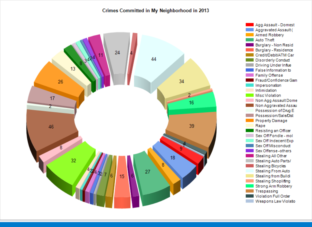 This is a 3-D exploded donut chart that shows the number of crimes committed by type.
Now let’s try to answer the question with this graph: 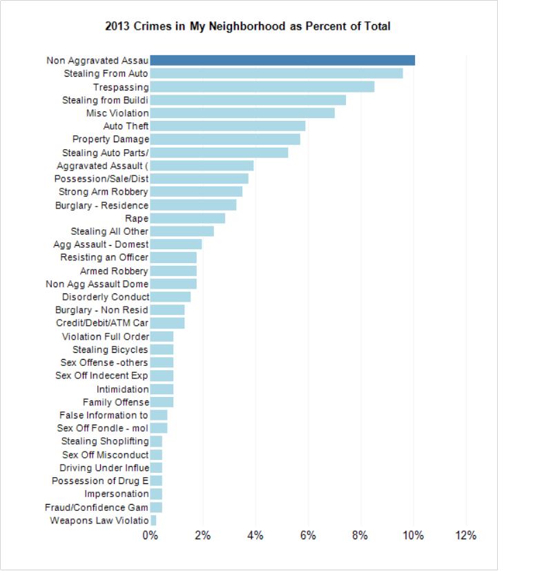 This is a bar chart that shows the types of crimes committed as a percent of total crimes. I think you will agree that you immediately see from this graph that non-aggravated assault is the most common crime, followed closely by stealing from an automobile. I can easily see the percent of total incidents that each type represents and how each type compares to other types.
Even if your data isn’t saving any lives, you can still learn to make professional data visualizations that effectively communicate information while being visually appealing, which can impress and earn trust from your management, clients, and other audiences. If you would like to learn more, I would love for you to attend my session in KC or Albuquerque. If you can’t make it, feel free to check out the slides on the Presentation page.
One Comment